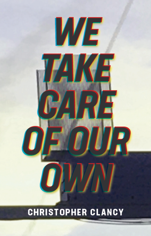
Behold, the cover of We Take Care of Our Own:
Do I love it? Hey, it does the job. The title is legible and my name is spelled correctly.
But before posting it here, I showed this cover to two people—my wife and an old friend—and on both occasions the first thing out of their mouth was, “What’s that thing in the background?” I will now answer that question here, in the hope that a small handful of friends or family/future book buyers might happen across this blog post and not ask me, face-to-face, what that thing is.
Like a lot of people, I do not consider myself a photographer per se but I enjoy snapping pictures on my phone. If I come across something striking, like the moon coming through a tree or ivy climbing up the tires of an abandoned tractor, I’ll pull out my phone and take a picture. What do I do with these pictures? Nothing.
One afternoon I was on my usual three-mile run. The halfway point of this run, where I can take a break and walk around for a few minutes, is located at a gas station next to a very busy street. Well, the gas station went out of business (a much larger gas station-mini mart opened less than a block away), resulting in its fast dilapidation: the windows cracked, the roof over where the pumps used to stand started to sag, and the sign facing the street fell apart, its white plastic cover falling away to reveal the electric light guts underneath. Finding these guts interesting, I snapped a few pictures with my phone. Here’s one:
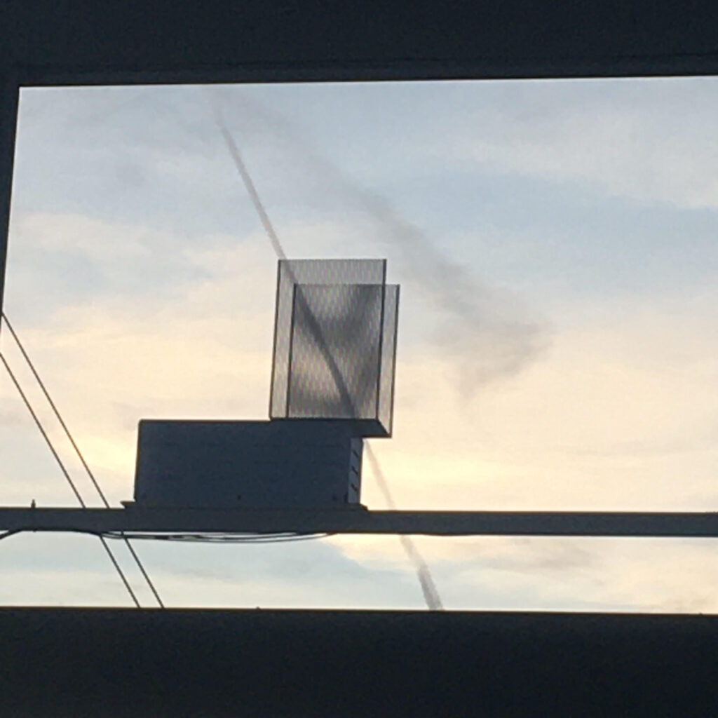
OK, fine. A black box topped with a pair of screens that presumably glow and lend the would-be sign its light, with the contrail of a plane in the distant background, the line of which matches pretty closely to a pair of nearby wires. Interesting, possibly, in a found and abstract way. There’s something strangely feline about the way the black box-screen structure is positioned.
A year or so later, I found myself fooling around with possible covers for We Take Care of Our Own on Canva. I took this picture (left), slapped some Helvetica text on top, and voilà, the cover of my novel-in-progress. Childish? Yup. A colossal waste of time, especially as there was most likely decisions that needed making, errands that needed running, real work that needed doing? Ha, you know it!
Fast forward another year or so, and now Montag Press is asking if I have any ideas for book covers that they can send along to the artist assigned my book? Well, it just so happens I do have a few ideas, thanks for asking—this picture was one of them.
Well then, said my publisher, no doubt realizing he could save his company an artist’s fee, why don’t we just use this picture? Won’t it be blurry, I asked? Yes, probably, my publisher answered, but that would only add to the hip, with-it, edgy-glitchy effect, which is entirely in keeping with your hip, with-it, edgy-glitchy story!
Fine, I said. I’ve never cared much about book covers anyway. Young authors tend to get precious about their covers, as if the look and feel of the object was as important as the information that the object contains. Being a not-so-young writer, I don’t feel that way. Still, it’s hard to not to feel a bit like an ambivalent bride in an arranged marriage: I’m not head-over-heels but I’m sure I’ll learn to love it in time. Besides, I was such an enormous pain in the ass about the book’s editing and layout—that’s a story for another blog post—that to suddenly order them to stop the presses, I’ve changed my mind, even though I myself submitted the photo in question and signed off on the cover weeks ago, might well result in my queering the whole deal. And then I’m left with nothing, no cover because no book. Again, being a not-so-young writer, I’m not real keen on remaining unpublished one minute longer than I have to. Like I’ve grown fond of saying in my middle age, “perfect” is the enemy of “good,” but “good” is the enemy of “done.”